Introduction
This project is about how we made our own media studio, what challenges we faced and how we overcame these challenges.
Target Group
The target group of this project are our teachers and later clients. This is also why we asked feedback to our teachers. In later stages of our brand you will see our feedback matches our target group. This is really important to truly get good feedback.
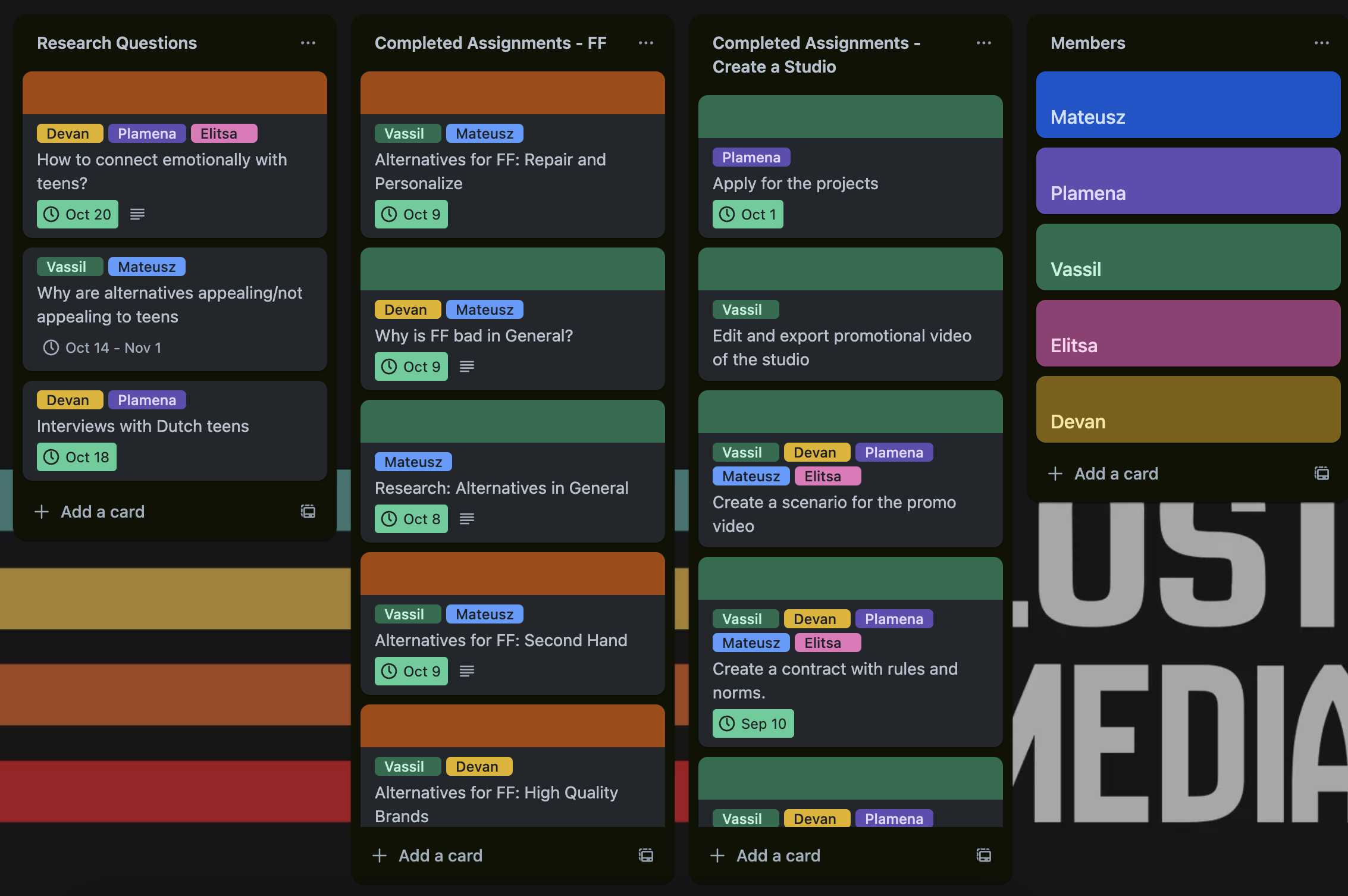
Trello & Contract LO4 & LO5
Before we started working on our own studio we wanted to make a Trello board and a contract. The Trello board will be used to add new assignments. Each assignment will have a deadline and teammembers added. Using this method our whole team can see what everyone is working on and what assignments are finished/unfinished.
The LogoLO1 & LO3
Logo 1LO1 & LO3
I started brainstorming for our logo and made the first logo design. It is based on old film tapes using the tape roll and the tape itself with our studio's name on it. I showed this idea to our group, but they told me that the logo looks like our studio is a movie production studio which isn't what we want.
Logo 2LO1 & LO3
After we discussed as a group that we want to make a logo that represents all of us together. That is where I found a Ransom Letters logo which we all liked so we started working on a logo where each person writes Lost Media on paper and where we chose each letter for our logo. This took a long time.
Feedback - Josh LO4
We were really proud of our Lost Media Ransom Letter Logo. But still wanted to hear what different teachers had to say about it. Josh told us that the idea of the logo was really unique but did not really fit the Lost Media name. He told us that the logo was a MTVish logo from the early 2000's. Luckily Matheusz made an extra logo that has a retro design. Josh really liked this logo and thought that would perfectly represent our brand (classic and future combined).
Final Logo LO1 & LO3
With the feedback from Josh. Matheusz updated the logo so that it would be cleaner and simpler to use. He added four lines to the left of the logo each representing a color. and used the New Amsterdam Font for the typography.
 Figure
4.1
Figure
4.1
 Figure
4.2
Figure
4.2Validation LO4
We showed Josh our final logo and he was happy with this design. He told us that is was simple and it could be used everywhere. He also gave us a tip to use the stripes in other designs for example headers in documents or make custom elements we can use in our branding.
Brand GuidelinesLO1
Of course our brand also needs a Brand Guide. This document is made to easily set standards and rules for our brand. For example our final logo, brand colors and typography. You can look at it like it is our framework of our brand.
Sticker & Business Card LO1
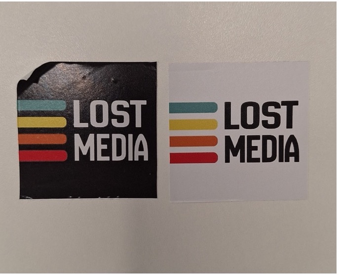 Figure 5 -
Matheusz
Figure 5 -
Matheusz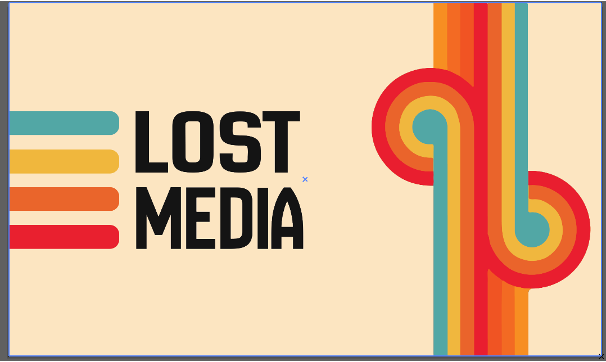 Figure 6.1
- Devan
Figure 6.1
- Devan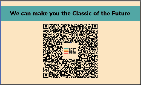 Figure
6.2
- Devan
Figure
6.2
- DevanBranding DocumentLO1 & LO3
During the development of our own brand we finally also made a branding document to easily present to clients. I tried to write this document as formal as i can and still keep the core features that makes us unique.
FeedbackLO4
I asked a few questions to the target audience to hear what they think of the document. They gave me feedback that the document was easy to read and that there was a lot of information that was important to have in the document, They also told me that the style of the document was dull. I will add a style to the document in my next iteration.
Iteration 2 LO1 & LO3
Plamena took the role to finish this document and to make it nice. You can see the final version below, as you can see it looks way better visually.
Validation LO4
After Plamena made the second iteration we went back to the target audience and asked them what they think of this new version. They told is that the document looks better visually and that it is more readable now.